Flag Friday is a periodic discussion of the world's national flags; the project is explained and indexed here.
These discussions are about graphic design, and perhaps about nationalism and national symbolism in general. They should not be taken as critical of the countries, ideals, cultures, or people that the flags represent.
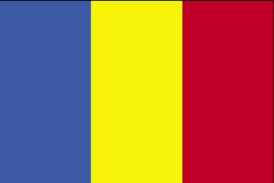
Chad

Parsons: Parsons: Complaining of a "Bad Tricolour," he gives it a “B-”, 65/100.
Michael5000: Well, what we have here is a tricolor. I don't see what's "bad" about it, particularly -- it's got the three primary colors, a pretty obvious set.
Now here's the deal: Romania has a virtually identical flag, and Moldova, which is arguably the Romanian chunk of the old Soviet Empire, has a very similar flag but with a coat of arms on the center yellow stripe. So, you might be tempted to accuse Chad of copping a design already in use by a European country. But not so fast! Chad came into being and designed its flag in 1959, when the French high-tailed out of Africa, and Moldova's flag didn't come along until 1990.
But what about the old-school country of Romania? Well, it had used a blank tricolor in the past, but during the communist era -- that's from WWII to the early 90s, for those of you who were born yesterday -- there was an appropriate communist national symbol in the yellow stripe. After the cretinous Ceauşescu dictatorship was toppled in the late '80s, these symbols began to be torn off or cut out of Romania's flags, sometimes leaving a defiant hole in the yellow stripe. In 1989, the blank tricolor was made official -- but this rendered Romania's flag identical to what was now an existing national flag, Chad's. Chad complained about this to the U.N. in 1994, but Romania understandably didn't feel like changing at that point. I can't imagine that anyone in the international diplomatic community felt too excited about taking the question on; in any event, the issue seems to have faded. If Romania and Chad ever go to war using 18th Century infantry tactics, though, there's going to be real trouble.
Grade: A-
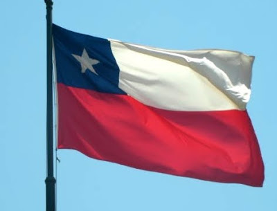
Chile

Parsons: He gives it an "A-", 80/100, without comment.
Michael5000: For a UnitedStatesian, the flag of Chile is disconcertingly similar to the flag of Texas, a much wider political unit. Looking past that, something about Chile's flag -- perhaps is it the blue square amidst all the flaggy rectangularity -- mildly displeases me. It's a flag design without any glaring flaw, but also without any glaring merit.
Grade: B
China

Parsons: Disliking "too many stars," he assigns a "B", 73/100.
Michael5000: Pow! China's flag is instantly recognizable with its hot, hot colors and minimalist design. It's true that there are rather a lot of stars there, and that a star is not the most original of design elements, but interestingly I don't think I've ever really thought about the starriness of this flag. I think of the People's Republic's flag (we'll deal with the ROC later, under "Taiwan") as "the red one with a splash of yellow in the upper left). Which kind of works!
Grade: A-
Colombia

Parsons: It's "original," but only gets a B-, 65/100.
Michael5000: A horizontal tricolor without the stripes at their typical even widths, the flag of Colombia is to an extent "original" -- until you look at the strikingly similar banner of its neighbor and chronic rival Venezuela, or the even more strikingly similar banner of its southern neighbor, Ecuador.
The Venezuela/Ecuador/Colombia flags use the same essential primary colors as the Chad/Romania/Moldova flags, but employ them horizontally instead of vertically and with the yellow stripe taken out of the center.
Grade (for the current flag): B+
Comoros
Here's the flag of Comoros that Parsons reviewed:
.jpg)
Parsons: Disliking "Writing!", that it's "too busy," and that it has "too many stars," but liking "good colours," he gave it a "D+", 48/100.
In 2002, though, Comoros unveiled a new flag -- its sixth since 1975, making it possibly the most unstably flagged country in the world..jpg)
Michael5000: I kind of like it! The stripes liven up the white-on-green stars 'n' crescent action of the earlier iterations, with the red and yellow especially adding some warmth (although I fear Parsons would likely find them "eye-watering." The white stripe looks a little goofy with the flag spread schematically on a computer screen, but in context you would see that white stripe against the sky or some other kind of colored background, where it would probably look a little sharper. My recommendation to the people of Comoros: you've got a winner. Stick with this one for a few decades.
Grade: A-


8 comments:
I don't like the Colombian one. I dislike the large stripe on the top. Maybe if it was in the middle, or anywhere one a vertical tricolor, it would be okay, but it just seems top-heavy and weird to me.
OK, I have a rather long and involved story on the PRC flag, the fact that it has *five* stars, and the pun-friendly nature of Mandarin.
There are several ways to look up words in a Chinese dictionary; one of them is by sound. If you go to the section where you look up words by sound (and tones), you'll find 20, 30, 40...or more words under each sound+tone combination. And if you combine all the words with the same sound but different tones, then you're looking at 100, 200 or more words. Lots of words to make puns with, in other words. (Joke not intended there.)
In Mandarin, the PRC flag is called wu xing qi -- "five star flag." Wu with 2nd tone is "five," but if you say it with first tone, one of the meanings can be "soiled" or "spoiled."
In Taiwan, in the 60s and 70s, all the media were controlled by the government. And they all substituted the "five" wu with the "soiled" wu. Growing up there, I used to wonder why anyone would ever name their own flag like that?
Then there's the matter of the Chinese term for 'communism,' which is another long & involved story, so another time.
Morgan, I thought the same thing!
Comoros (the new one) is my favorite out of this batch.
I love the Moldova/Chad twofer. I agree with Chad that Moldova shouldn't be able to have the same flag as them, though. Go ahead, Moldova, put a dot or a crest on it.
And the Colombian flag looks upside-down to me.
I fear that the yellow in Colombia's flag will at some point crash through the blue and red we'll have a true flagedy. That is what can happen when a country ignore the proper weighting of their stripes.
Too many stars? I agree with you, it's a sharp flag, and pretty sparse. Would 3 total stars really improve it.
Comoros' is the shiznit. Big fan
Hey, chuckdaddy--
how about some growing-baby pix?
Michael: This flag stuff is great - my favorite feature of the Michael5000 blog.
Morgan: I hear you -- but I wonder what it would look like in action. I think flags often look better against the sky or skyline or whatever than they do in diagram, and I'm guessing this is true for Colombia's.
fingers: Awesome. Thanks for the anecdote.
Jennifer: I think I like Comoros best in diagram, and the five/soiled-star flag best qua flag. Know what I'm sayin'?
Aviatrix: Chad's never going to get a hearing on it. Can you imagine a third-party diplomat agreeing to arbitrate? It would be like hiring a construction company to build a special political third rail just so you could go and touch it.
chuckdaddy: Always good to get your take.
Elaine: He's never going to let the Xpress roll again, I fear, so I shall summarize: the boy is an athletic giant of a toddler: imagine him hopping on a little trampoline from dawn to dusk. The girl is a mellow little sweetie who smiles a lot.
Eric: If you like Flag Fridays, you'll LOVE Vexillophilia. All Flags! All the Time! A Cartophiliac/Michael5000 joint venture.
Post a Comment